
Design
Jul 4, 2026
A Brand That Practices Design as Magic
What happens when there's no client, no product, no company, just a prompt to invent all three from scratch and then design the identity that holds them together.
Category
Design
Reading Time
6 Min
Date
Most branding projects start with something already there. A founder, a product, a market position you're trying to sharpen or shift. This one started with none of that. It was the capstone for a Graphic Design Specialization I did with CalArts toward the end of 2025. The brief was almost unsettling in how open it was: build a brand for a startup that doesn't exist and figure out everything about it yourself.
No client to interview. No existing personality to react to. Just me, a blank page and the job of inventing a company convincing enough that a stranger could believe it had been around for over a decade.
I decided to build a branding agency, one that didn't just talk about grabbing attention but treated the whole idea of it as something closer to sorcery. That single decision, made early and almost on a whim, ended up shaping every choice that followed. This is the story of how that idea became ENViN.
Giving It a Reason to Exist
Before I let myself sketch anything, I sat with the question of why this company would exist at all. Not what it does, but where it came from and what it believes. I wrote a short history for it, founded in 2011 in a tucked away lane of an old market city, by designers who'd grown up around folk tales, street performers and hand painted signage that once guided travelers who couldn't read a map. Their whole approach to branding came out of watching how a symbol or a rhythm could hold someone's attention without ever asking for it.
It sounds like a small thing, writing a backstory nobody would technically ever read in full. But it gave me something to check every later decision against. Whenever a color felt off or a typeface felt like it belonged to a different company entirely, I could ask whether it matched people who believe design works a little like a spell. That question ended up doing more design work than any brief could have.
Getting Everything Out of My Head First
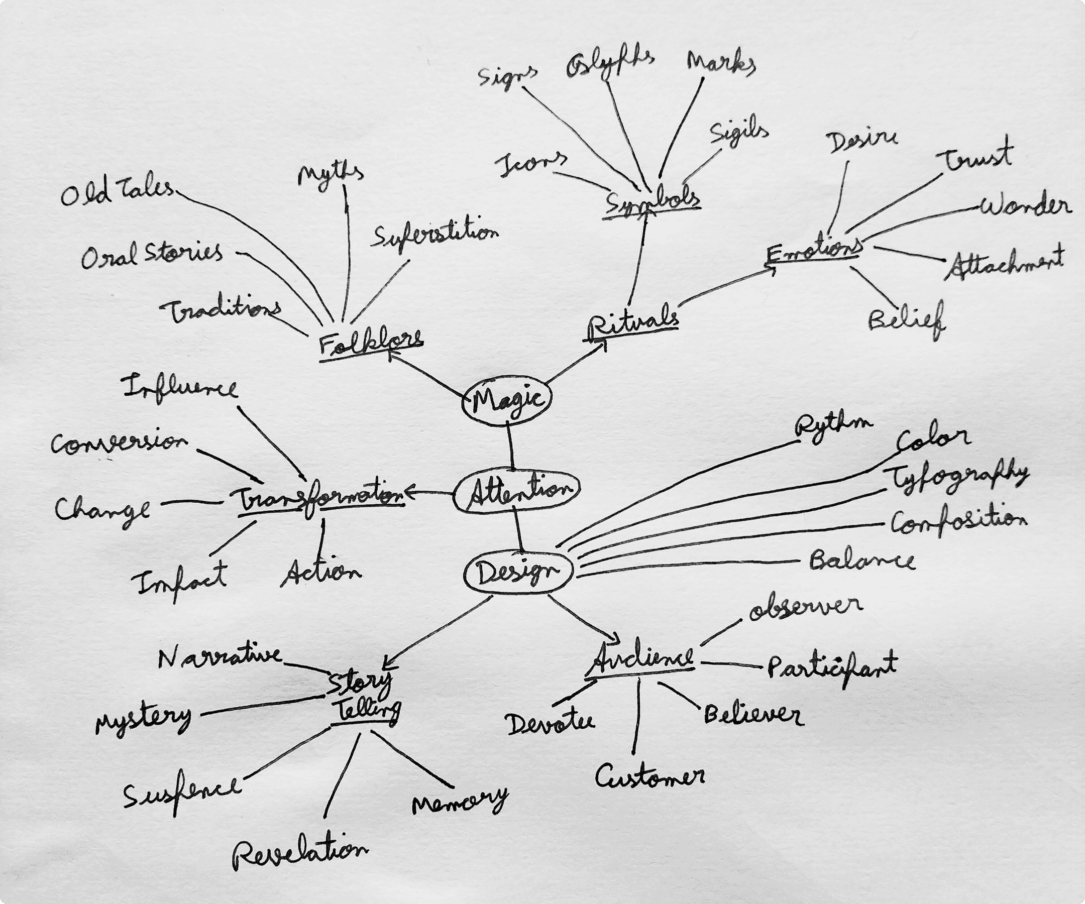
Once the premise existed, I didn't go anywhere near a logo. I sat with a pen and just let the concept sprawl outward on paper, starting from the word "magic" and following wherever it wanted to go. Folklore led to superstition, superstition led to symbols and sigils, symbols led back into design principles like rhythm and composition and somewhere in there, audience and storytelling crept in too.
It's tempting to skip this kind of mapping when you already have a strong concept and just want to start designing. But this was the stage that gave me the actual vocabulary of the brand, words like sigil, glyph, ritual, that I wouldn't have landed on if I'd jumped straight into type explorations. Three words eventually rose out of that mess and became something like a compass for everything after: enchanting, mesmeric, ritualistic. Every visual decision from here on had to earn one of those three.
Finding a Name That Felt Right
Naming came next, and it's always the part that resists being rushed. I tried a few directions that leaned harder into the occult angle, things that felt more like a tarot brand than a design studio. They read as costume rather than character. ENViN was the one that felt lived in. Short, easy to say out loud, with just enough strangeness in the spelling to suggest something was slightly off in a good way.
Sitting Between Two Worlds
With a name and a philosophy in hand, I went looking for references and ended up pulling from two very different eras at once. One side was entirely contemporary, colorful illustration, geometric eye motifs, crystal imagery, fractal art, and actual identity work from studios doing this professionally, just to stay honest about what a real agency's output looks like.
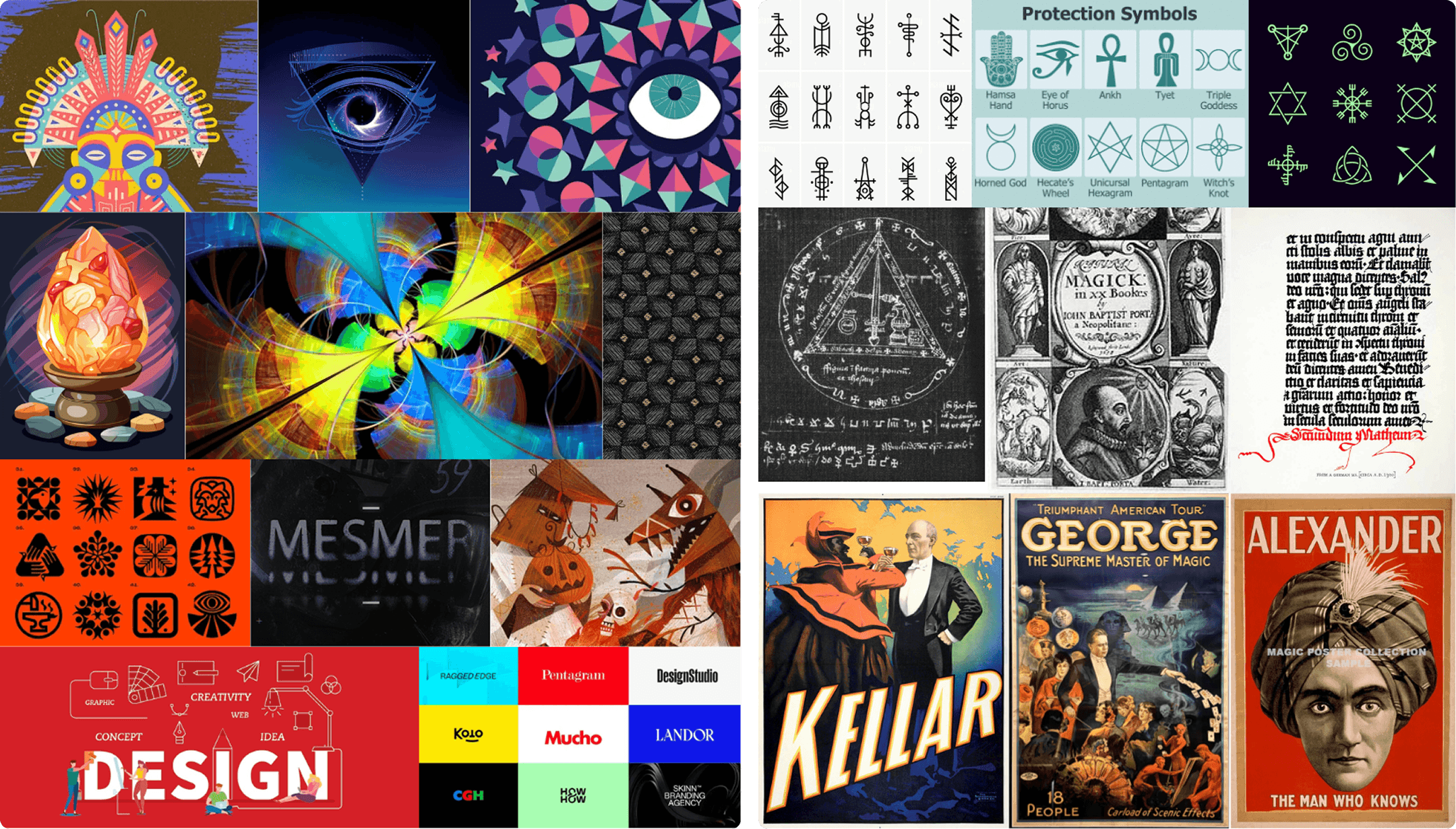
The other side went backward, into old protection symbols, handwritten grimoire pages, occult diagrams and vintage posters from stage magicians performing under names like Kellar and Alexander. Looking at those side by side made the tension of the whole project obvious. This had to be a brand that felt genuinely current while still carrying something old and slightly unexplainable underneath it. Everything from here on had to hold both of those at once without tipping too far into either.
The Letter That Changed Everything
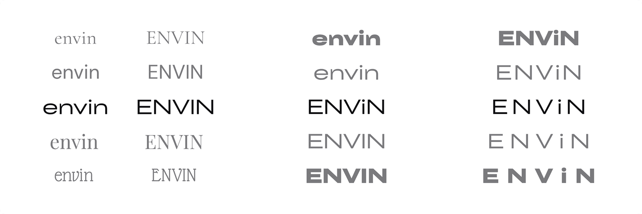
Type exploration is usually where I expect to grind for a while, testing weight after weight until something clicks. This time it happened almost by accident. I was running the wordmark through different cases, mostly out of habit, all caps, then lowercase, then something in between, when I left a single letter lowercase in an otherwise all caps word almost as an experiment.
That one lowercase "i" sitting in the middle of ENViN ended up being the whole idea in miniature. A controlled, contemporary wordmark with one small interruption in it, like something flickering just under the surface. Once I saw it, nothing else felt right anymore. The final wordmark uses CY Grotesk Grand with wide, deliberate spacing, and that single lowercase letter doing more storytelling than the rest of the word combined.
Choosing Colors That Feel Like Dusk
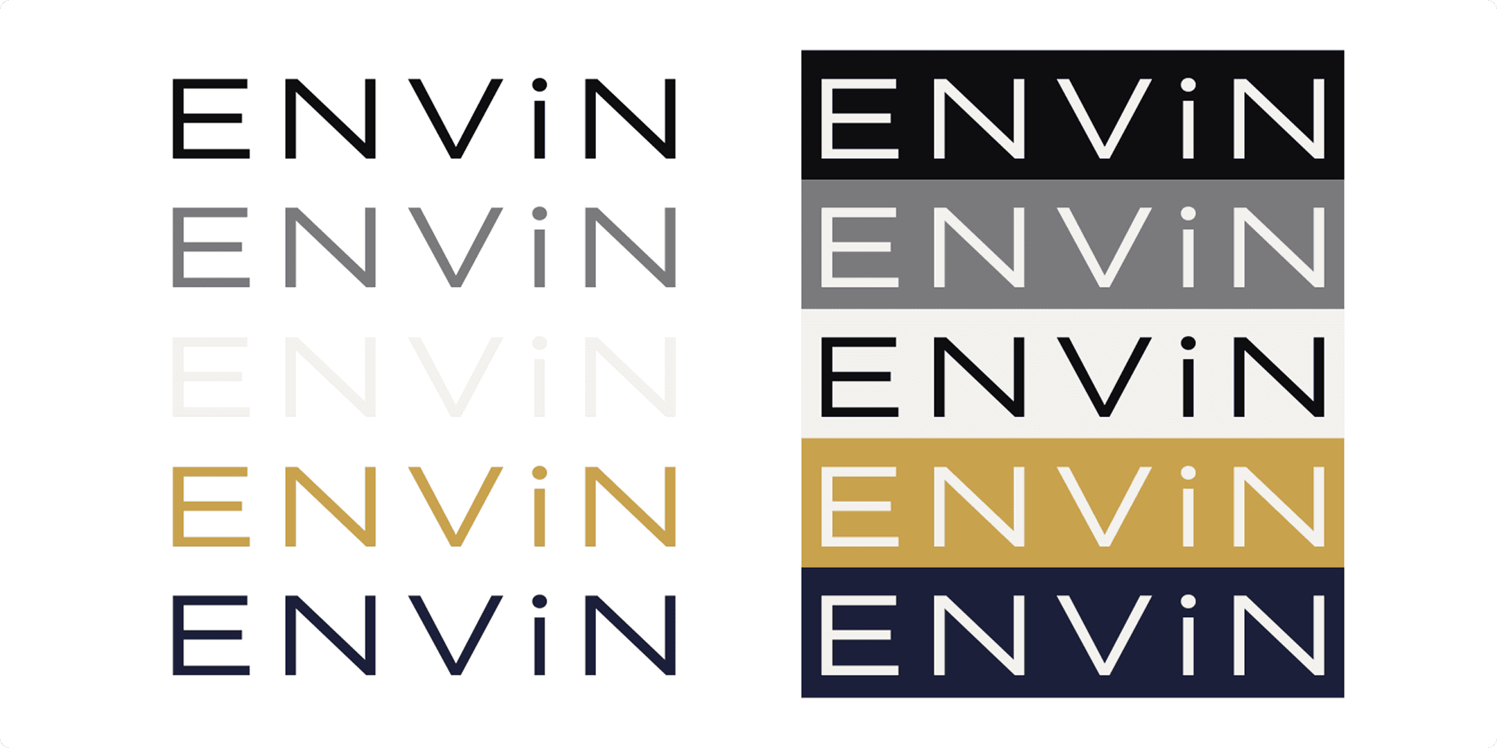
Color needed to hold the same duality as everything else, restraint on one side, mysticism on the other. I built the palette around a deep indigo and a near black as the grounding base, an antique gold as the one accent that gets to feel ceremonial, and a soft white and warm grey to keep things usable outside of dark backgrounds. Nothing in the palette shouts. The gold only shows up when it means something.
Drawing a Symbol to Sit Beside the Word
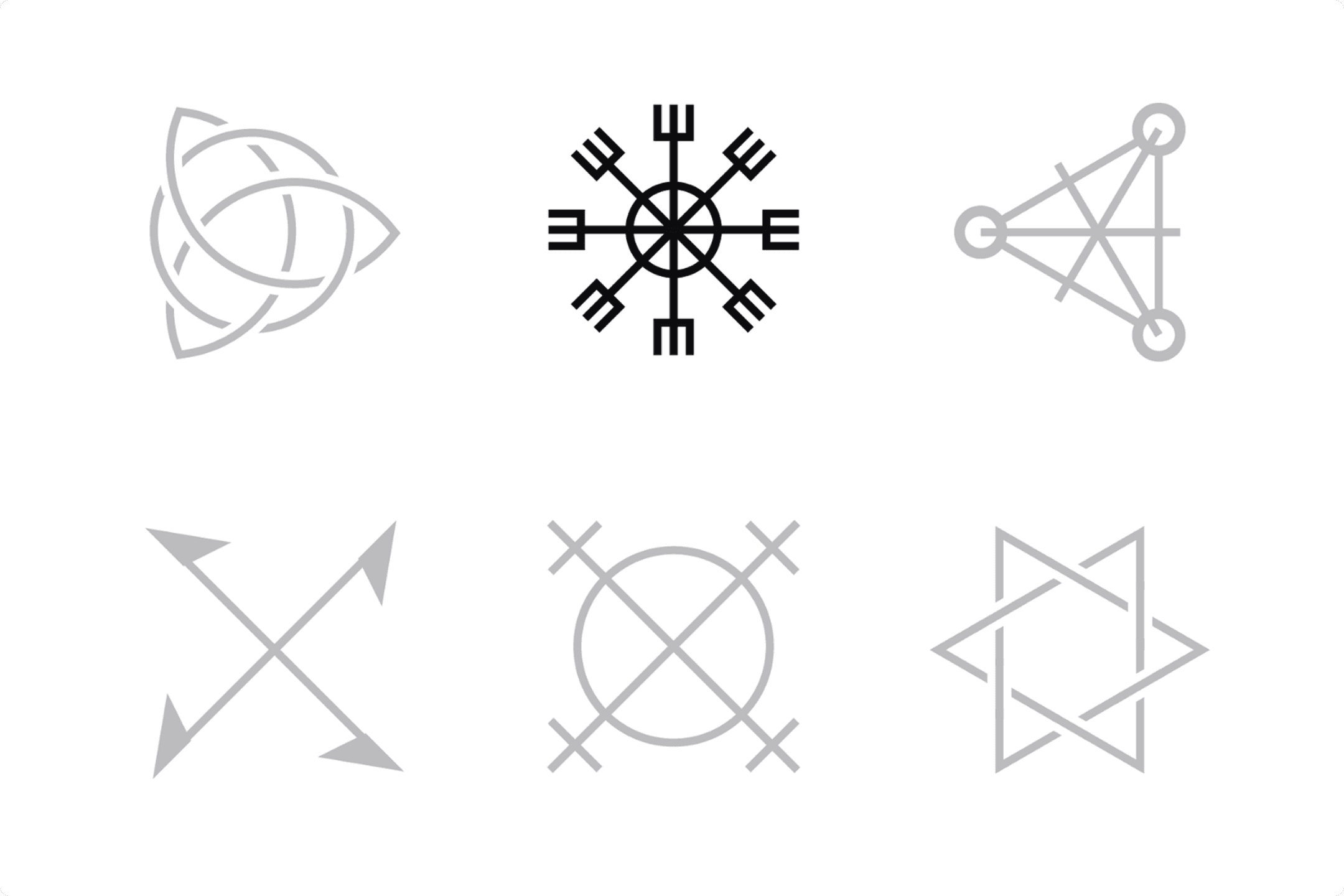
Alongside the wordmark, I wanted a mark that could stand on its own, something closer to a seal than a logo. I tested a handful of directions rooted in old protection symbols, interlocking arcs, star patterns, arrow crosses, before landing on a form that reads like a rune compass, eight points radiating from a central circle. It doesn't compete with the wordmark. It sits quietly beside it, doing the same job the lowercase "i" does, hinting at something ritualistic without ever spelling it out.
Letting the System Breathe
Two typefaces ended up carrying the brand's voice at different volumes. A serif for anything that needed warmth, the kind of text that reads like it's telling the founders' own story. A clean geometric sans for anything functional, interfaces, structure, captions.
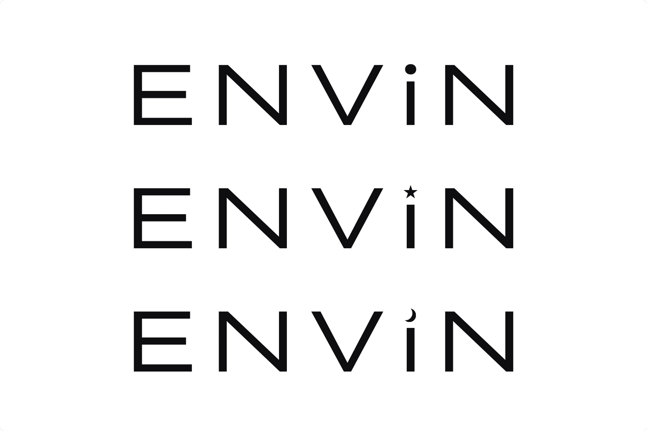
The detail I'm still fondest of, though, is one most identities never bother building. The dot above that lowercase "i" isn't fixed. It can shift, a star, a crescent, some other small mark pulled from the brand's own visual language, depending on where it shows up. It's the one place in the whole system where the idea of design as magic gets to live physically inside the logotype itself, instead of just being described around it.
Watching It Hold Up in the Real World
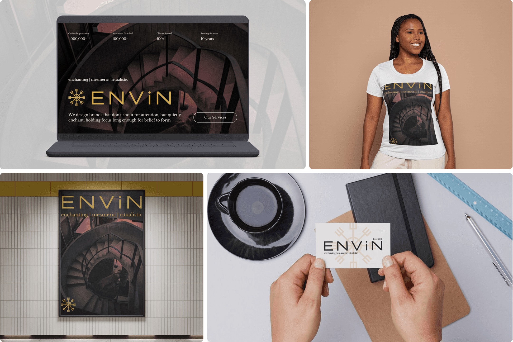
The last stretch was the most satisfying part, taking the identity out of the studio and dropping it into an actual website, a business card, a poster on a wall, a t-shirt someone might actually wear. Watching the palette, the type pairing and that quiet rune mark stay recognizable across every one of those formats was the moment the project stopped feeling like an exercise and started feeling like an actual brand.
Looking Back
I came into this project with a background across visual design, branding and UI/UX, mostly reacting to things that already exist. This was the first time I had to author the thing first, its history, its beliefs, its reason for being, before I was allowed to design a single letterform. That constraint turned out to be the most useful part of the whole process. Every decision had a story to answer to, which made the identity feel considered rather than assembled.
The full case study is up on my portfolio, with the research, the exploration and every application shown in full, if you want to see how the whole system comes together.
Related Articles

