
Design
Aug 3, 2026
A Bird That Tells You Land Is Near
A redesign built around one idea: brands get a few seconds to prove they're worth following, so give people something worth following.
Category
Design
Reading Time
5 Min
Date
When I joined Albatross Design House, the website and visual language were already strong. The typography worked. The palette worked. Nothing about it looked broken. But sit with it for a few minutes and you'd notice what was missing, the founders' actual vision and a presence that felt like theirs in a design space that's already crowded with people who all know how to make something look nice.
Strong and distinct aren't the same thing. That gap was the whole brief, and it's the story I want to walk through here.
Why an albatross
I spent longer than I'd like to admit just sitting with the name before I touched a single frame in Framer.
Sailors have always had a particular relationship with this bird. Spotting one out at sea has historically been taken as a sign that land isn't far. A nest, a coastline, a way back. The bird isn't just impressive to look at. It's a signal. It tells you where to go when you didn't know you were lost.
That's uncannily close to what Albatross Design House actually does for its clients, brands adrift in a market that's saturated with sameness, looking for the one thing that makes people stop scrolling and pay attention. The metaphor wasn't a stretch I had to force. It was already sitting right there in the name, waiting to be taken seriously as a design system instead of just a logo mark.
So, I stopped thinking of "albatross" as a brand asset and started thinking of it as a compass. Everything downstream of that decision, iconography, motion, even the cursor, had to behave like it was pointing somewhere.
The first few seconds
Albatross has a line they live by internally: a brand has only a few seconds to prove it's worth attention. Not paragraphs. Seconds.
The hero section had to carry that entire weight on its own. So, it does the most unsubtle thing it possibly could, a single albatross, wings fully extended, filling the frame against a saturating blue that reads almost like open sky and open water at once. It's large enough that you can't skim past it. You either pause or you scroll, and either way you've already engaged.
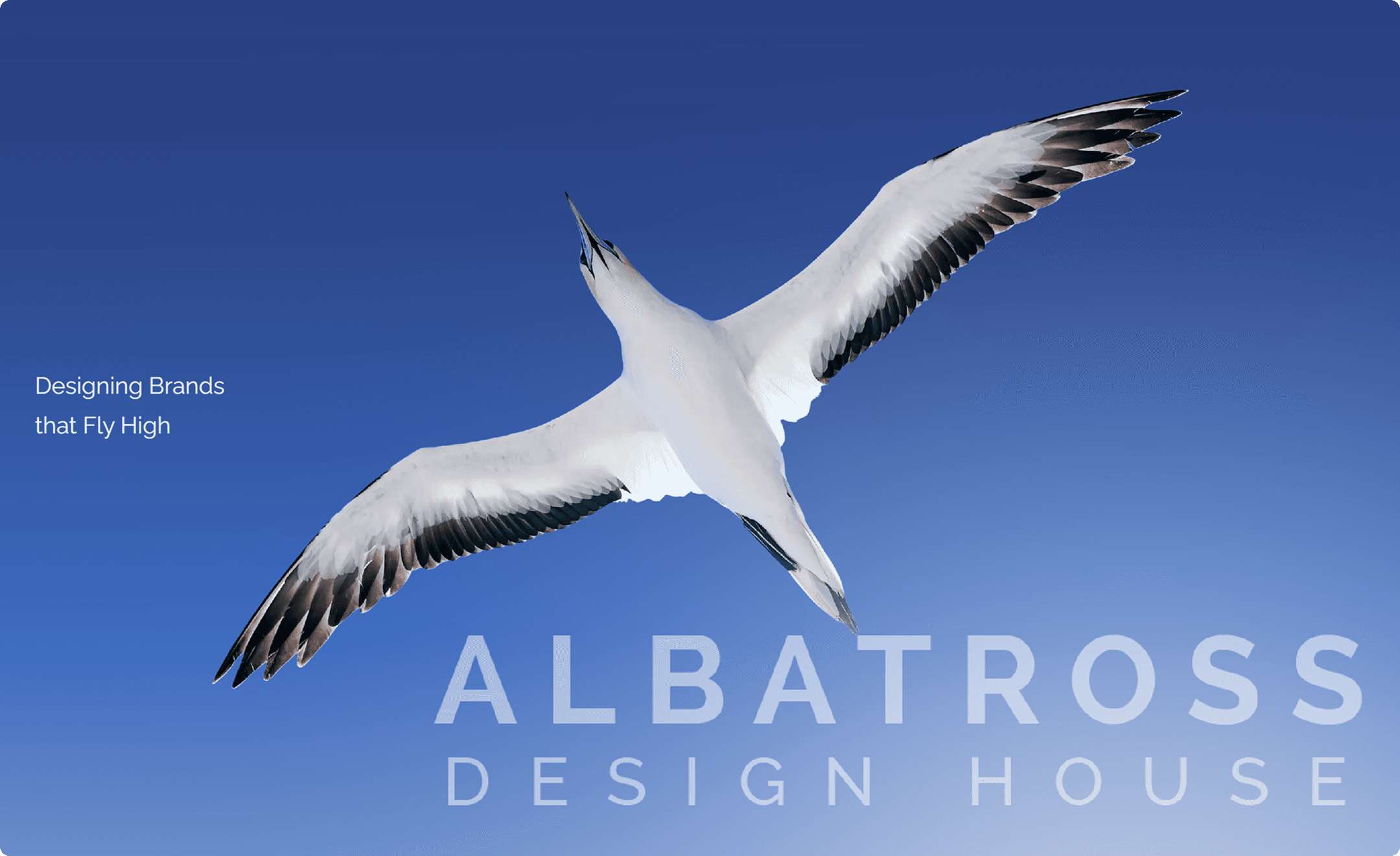
I wanted the follow-through to feel inevitable rather than decorative, so the sections beneath the hero keep pulling on the same marine thread through sailing imagery and a compass motif in the strategy diagram. Even the cursor changes state depending on what you're hovering, a tiny detail that most visitors will never consciously register but that keeps the whole experience feeling designed rather than templated.

None of that is one big idea. It's a lot of small, consistent ones, repeated until they stop feeling like choices and start feeling like the site's personality.
What's actually underneath
Here's the thing nobody sees on the client facing side: the polished interface is maybe ten percent of the actual work. The other ninety percent lives in Framer's component tree, and it's genuinely where a project like this either holds together or falls apart.
Every button on the site exists as multiple deliberate variants, not just a primary and a secondary, but distinct states for hover, loading, disabled, success and error, each one built and tested individually so a form submission feels like something happened rather than just refreshing into silence. The CTA buttons carry their own hover treatment where the dark fill gives way to that same warm gold on interaction, a small transition, but one that ties the interactive layer back to the same palette as the hero.

The navbar went through the same treatment across breakpoints. Desktop, tablet, and phone all get their own primary and open states, so the menu doesn't just shrink awkwardly at smaller sizes but was actually designed for each one. Social links got the same care: default, hover and black on white variants for every platform icon, because a portfolio site like this gets viewed against wildly different backgrounds and none of those icons can afford to look like an afterthought.
And then there's the CMS. The entire portfolio, every client project, its brief, its brand archetype, its industry tag, its hero image, runs through a structured content model in Framer rather than being hardcoded into the page. That's not a flashy decision. Nobody visiting the site will ever know it exists. But it's the difference between Albatross being able to publish a new case study in minutes versus needing a developer every time they land a new client. Invisible infrastructure, real leverage.
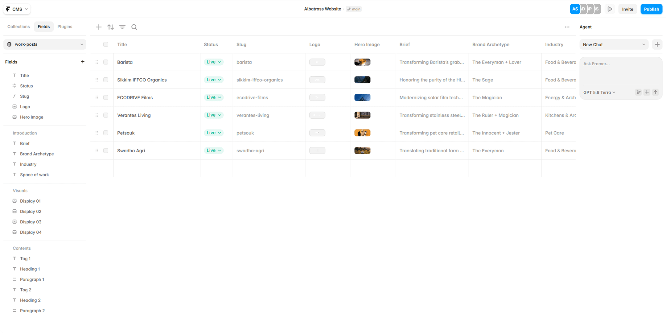
That's the part of this work I actually love most, the stuff that never shows up in a screenshot but is the reason the screenshot holds up under scrutiny.
Making it feel whole
The hardest part of a project like this isn't any single component. It's making sure a hundred separately built pieces don't feel like a hundred separately built pieces. Every button, every page loader, every menu transition, every micro interaction had to be considered against everything else, so the site reads as one continuous decision rather than a patchwork of good ideas stitched together under deadline.
That takes time. It takes the kind of pixel level patience that's easy to shortcut and expensive to fake. A project at this scale, done properly, doesn't happen in a short sprint, and it doesn't happen through one person either. The visual system and component architecture were my focus throughout, but a project like this is never a solo act. The strategy, the writing and the overall direction came together because a full team was pulling in the same direction, and that's worth saying plainly rather than letting a case study imply otherwise.
Where it landed
What Albatross Design House needed wasn't a facelift. It was a website that behaved the way their own philosophy claims to work, guiding people toward clarity instead of just looking clean while doing it. The albatross became less of a mascot and more of an operating principle: something that shows up consistently enough, in enough small places, that visitors feel steered rather than simply shown around.
I think that's the actual measure of whether a rebrand worked. Not whether it looks good in a screenshot (though I'd argue this one does) but whether the metaphor survives contact with every corner of the product. Buttons, forms, navigation, content system, all of it included.
Want to see it move the way it's meant to? Click through to the live Albatross Design House site.
Related Articles

