
Design
Jul 18, 2026
A Brand for the Moments Between Classes
A look back at building a brand identity from scratch for a college startup and the small idea that carried it from a napkin sketch to a full visual system.
Category
Design
Reading Time
6 Min
Date
Where it started: a visibility problem, not a participation problem
It was 2023, second year of college, and a classmate of mine was building CampusX, a social platform meant to be the place where all the scattered energy of campus life finally had somewhere to live. Clubs, fests, hackathons, jam sessions, robotics builds, dance battles, someone shooting hoops after class, none of it was actually missing on campus. What was missing was a way to find it. Everyone was piecing things together through random WhatsApp groups and whatever poster they happened to walk past that week, and CampusX wanted to fix exactly that.

I joined as part of the founding team to shape the visual identity and stuck with it through most of second year into early third, right up until college got busy enough that I had to step back. The platform itself never made it past beta testing, it stayed in that early, scrappy, figuring-things-out phase the whole time I was involved. But the brand still had to be built as if it was going all the way, because that's the only way a brand like this actually works.
Coming in this early meant there wasn't much to react to. No existing logo, no old guidelines, just a founder's vision and a blank page. And once it was clear this couldn't be another sleepy, institutional college app, the direction started to reveal itself. It needed to feel alive, current, a little loud, because that's what the culture it was representing actually felt like.
Three ideas the whole system had to carry
Before I touched a single typeface or color, I sat down with the founder and worked through what the platform actually needed to feel like, and it kept coming back to three words.
Discover, because opportunities needed to feel visible and easy to stumble into, no matter where a student was starting from. Participate, because the whole point was nudging people from watching things happen to actually being part of them. Connect, because at the core of it, CampusX existed to bring people, events, and ideas closer together.
Those three ideas ended up being more useful than any mood board. Every time I got stuck on a design decision later, whether it was how sharp the logo's angle should be or how loud a color could get, I'd just check it against these three and the answer usually became obvious.
Finding the mark: person, community, and the letter X
The logo took a bit of unpacking to get right. I wanted the mark to hold more than just a stylized letter; I wanted it to actually mean something.
It came together as a layering of three ideas. A single diagonal stroke representing the individual student. An X shape representing community, people crossing paths and connections forming. And underneath all of it, quite literally, the letter X from CampusX itself. Stack those together and you get the final mark, a bold, confident X that reads as both a symbol and a wordmark anchor.
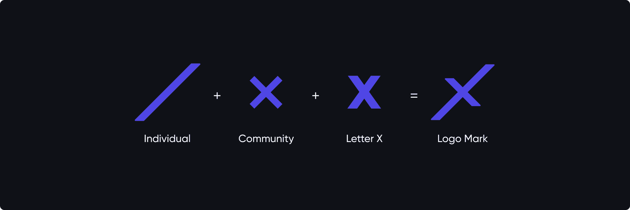
Once the mark was locked, I moved into refining the actual wordmark, working through the grid, the curves on the c and the p, the angle of that X, until "campusX" felt tight, fast, and unmistakably itself at any size.
Choosing a palette that felt like a concert, not a classroom
Color was where I let myself get a little more expressive. Instead of pulling from generic "tech startup blue," I actually looked at photos from campus events, concerts with stage lighting, DJ sets, fests lit up in purples and blues and pulled the palette straight out of that mood.
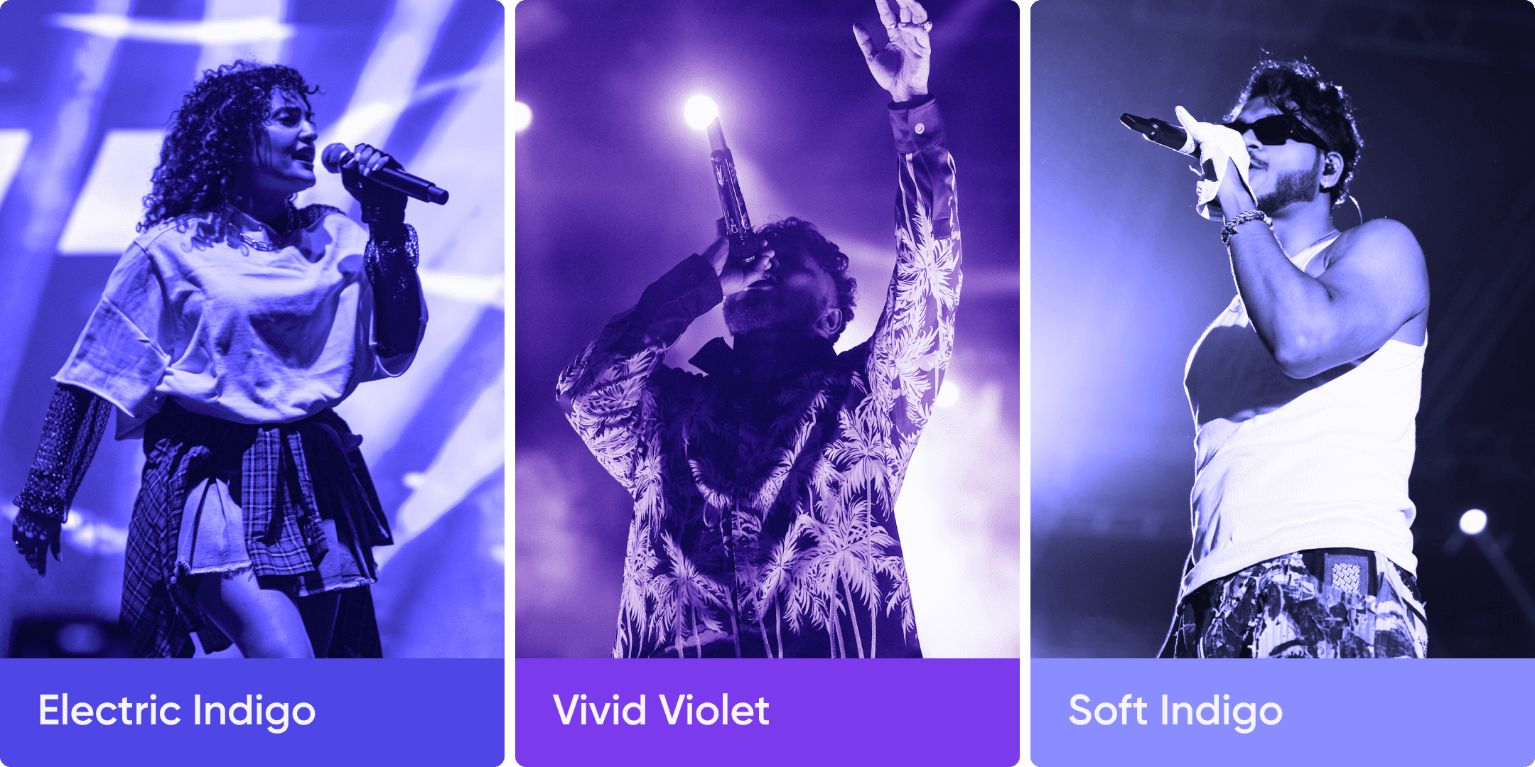
That's how we landed on Electric Indigo, Vivid Violet, and Soft Indigo as the core brand colors, backed by a set of deep charcoals and clean neutrals to keep things grounded. The palette needed to work in bright daylight posters and also glow under stage lights at an actual event, so testing it against real photography early on saved a lot of guesswork later.
Taking it from a logo to an actual living identity
A brand system only proves itself when it leaves the artboard. Once the core identity felt solid, I started pushing it into the places CampusX would actually live. Social templates, app screens, stationery, launch assets, event graphics and branded merchandise all became opportunities to see how the identity behaved in different contexts. Every application uncovered something new, whether it was a small refinement or a decision that made the whole system feel stronger.
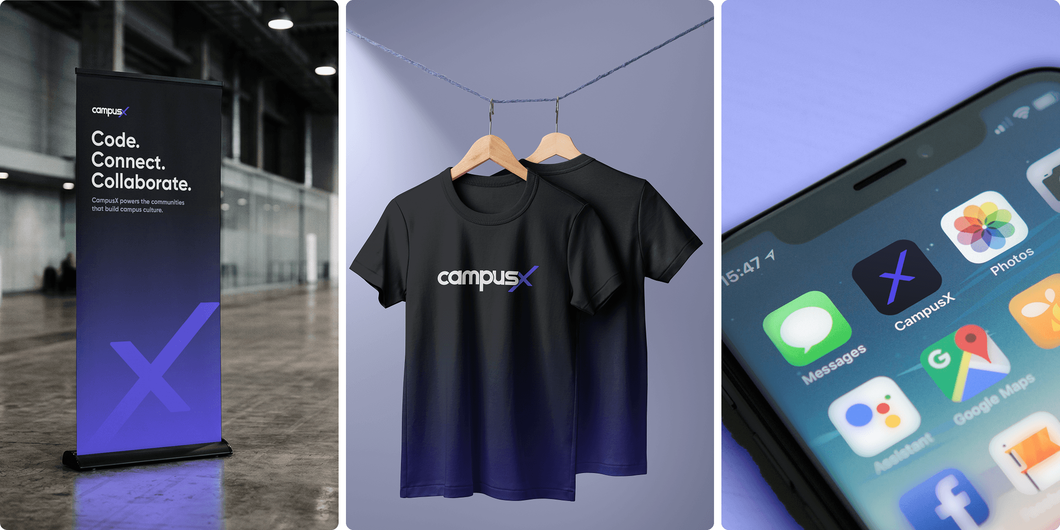
What I didn't expect was how much this stage would shape the brand itself. Patterns evolved because they had to work on lanyards, typography became more confident when scaled onto banners and the tone of voice found its rhythm through posters and launch teasers instead of a strategy document. By the end, it no longer felt like a logo with a set of supporting assets. It felt like a brand that could exist naturally across a campus, whether on a hoodie, a hallway banner or a student's phone screen.
Where it landed
CampusX never made it past beta, and I left the team as third year got busier and other things took over. But the identity stuck with me long after, so I went back and expanded on it, building out the mockups and applications you see here from the original files I'd worked on. It felt worth finishing properly, even if the platform itself never got the chance to.
What made the project worth revisiting wasn't any single piece, it was watching one small idea, an X built from a person and a community, hold up across everything from a business card to a building facade. That's really the test of any identity system. Not how good it looks in isolation, but how well it keeps its personality no matter where it shows up next.
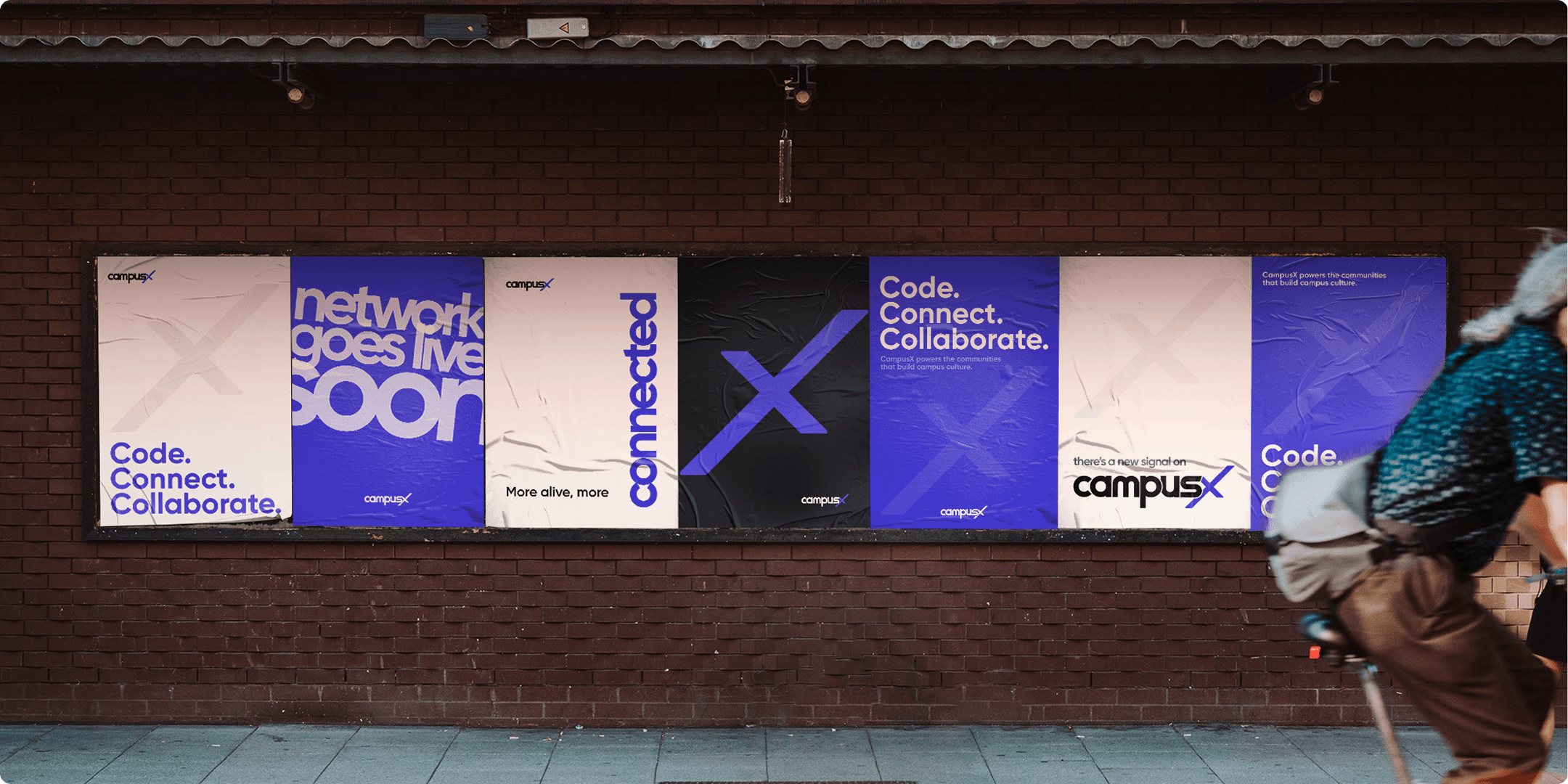
CampusX was, at its heart, about connection. Getting to build a visual language around intersection, movement, and belonging, starting when I was still figuring out how to design at all, is what makes this one stick with me.
Related Articles

