
Design
Jul 11, 2026
What I Learned From Trying to Fix Laundry Day
ZipWash started as a course project and turned into the closest thing I have to a personal case study in how good design actually gets built. This post walks through the process behind it, from spotting a problem worth solving to landing on a finished design system, and the decisions that shaped it along the way.
Category
Design
Reading Time
5 Min
Date
Picking a Problem Worth Solving
I did not want to design something abstract like a generic dashboard or a food delivery clone, mostly because that kind of brief gives you nothing real to push against. I wanted a problem with actual texture to it; something rooted in a life stage people actually go through.
Laundry kept coming back to me. Back in college, it was one of those things that came up constantly in conversation without anyone treating it as a real problem. Batchmates would mention missed pickups, inconsistent local shops, clothes that went missing for a week, prices that changed depending on who you talked to. Nobody was complaining in a structured way. It was just background noise of hostel life. But that noise was consistent enough that it told me something. There was no system here. Everyone had just accepted a bad default and built workarounds around it.
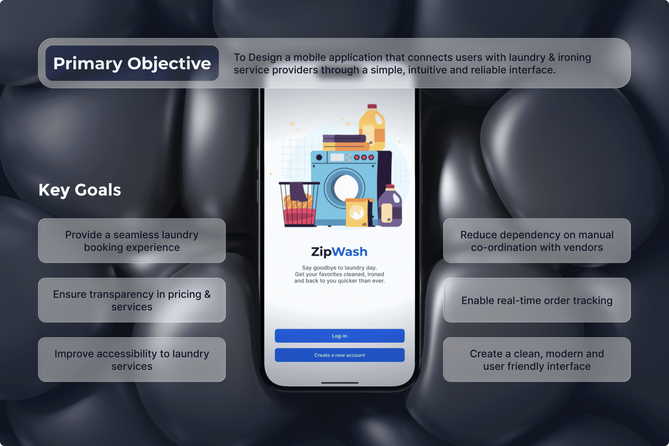
That became my starting point. Not "laundry is annoying" but "there is no reliable structure here, and an entire demographic has just normalized that gap."
Mapping the Actual Problem
Once I had a direction, I worked an empathy map to get past the surface level complaints and into what was actually driving them. What people said out loud was direct enough, comments about not having the energy for laundry or not trusting the service to show up on time. But the thinking underneath it was more specific. People wanted this handled with an actual system, not managed through informal favors. Missed pickups were not just inconvenient, they were seen as a genuine waste of time in schedules that were already tight.
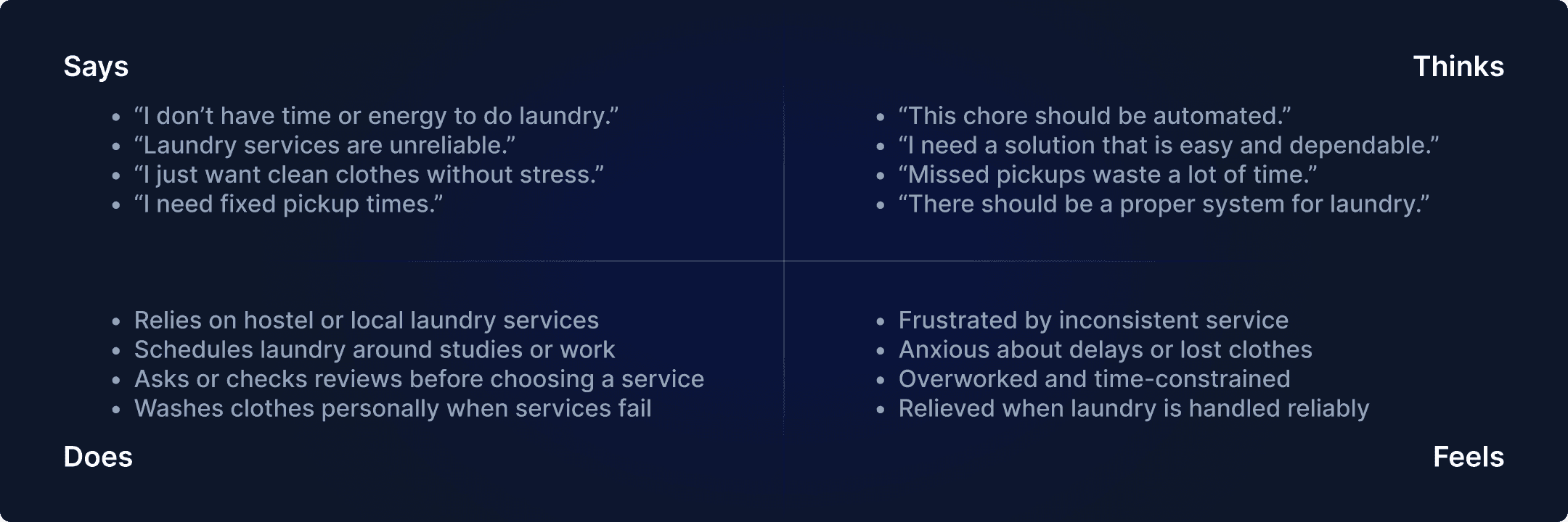
The feelings side of the map is what shaped the design priorities later. There was frustration, which was expected, but there was also a real undercurrent of anxiety around losing or delaying items, which is a small risk until it lands on you right before something important.
From there I built two personas, and I kept them deliberately different in what they prioritized. One represented someone with a stable income and a structured routine, focused on reliability and service that respected their working hours. The other represented someone in a hostel setup working with a tighter budget and less patience for friction, focused on speed, affordability, and a booking process with zero extra steps.
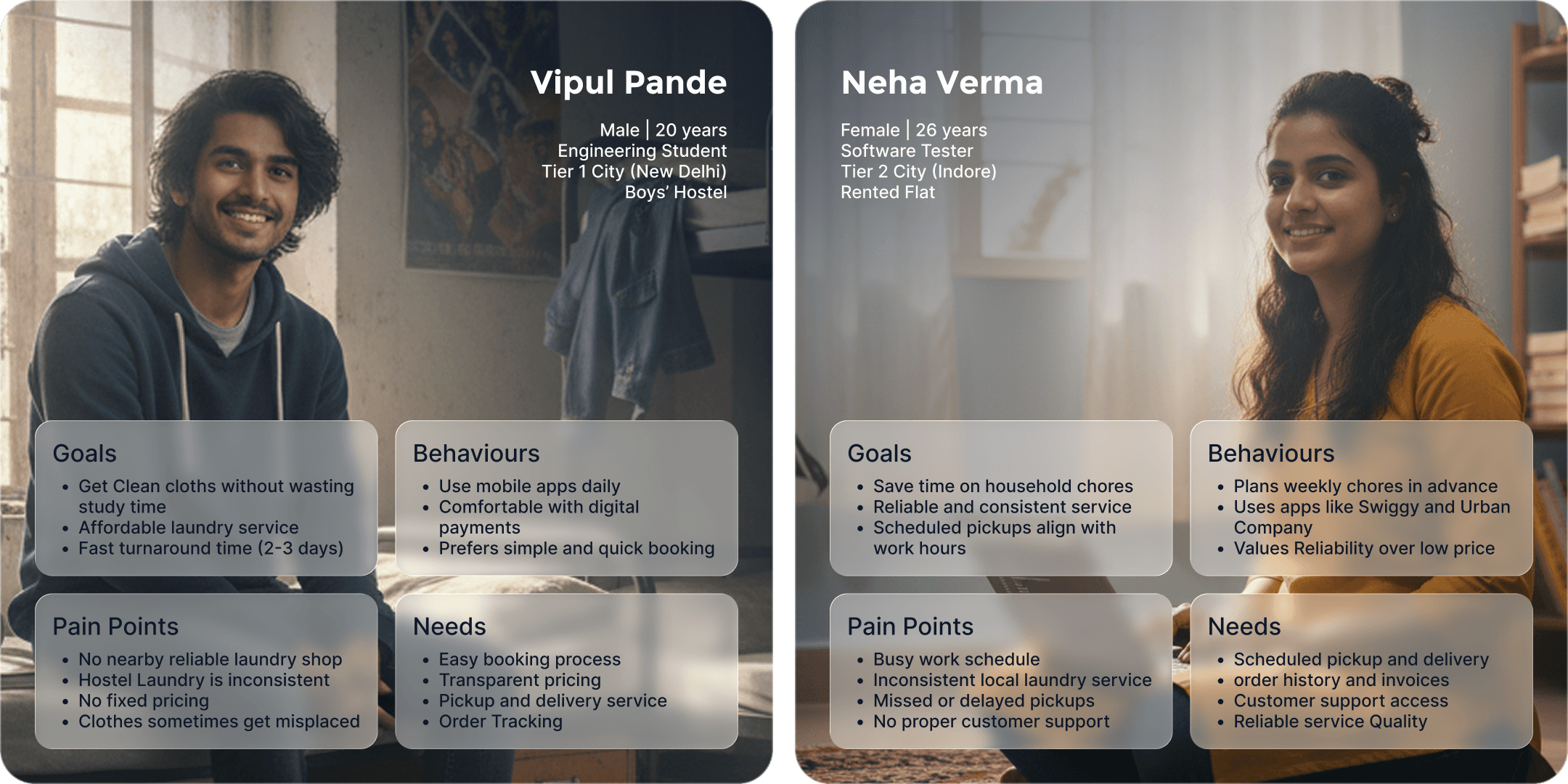
Keeping both of these in view at once was useful discipline. Any feature I wanted to add had to justify itself against two people who wanted different things from the same core service, which kept the scope honest instead of convenient.
Defining the Problem Statement
This is the step I expected to be a formality, and it ended up being the most important piece of the whole process. Writing the problem statement forced precision. It is easy to say laundry is a hassle. It is harder to write down exactly who is affected, why the current options fail them, and what a system needs to solve for.
I landed on this: people living in hostels, PGs, and rented flats in tier 1 and tier 2 cities have no reliable way to access laundry services, because the existing options are fragmented and have no digital backbone for booking, scheduling, or tracking. Once that was written clearly, the core feature set followed directly from it. Discovery of nearby services, digital booking, scheduled pickup and delivery, order tracking, and secure payment were not creative additions, they were the direct answer to the problem as defined.
Structuring Before Designing
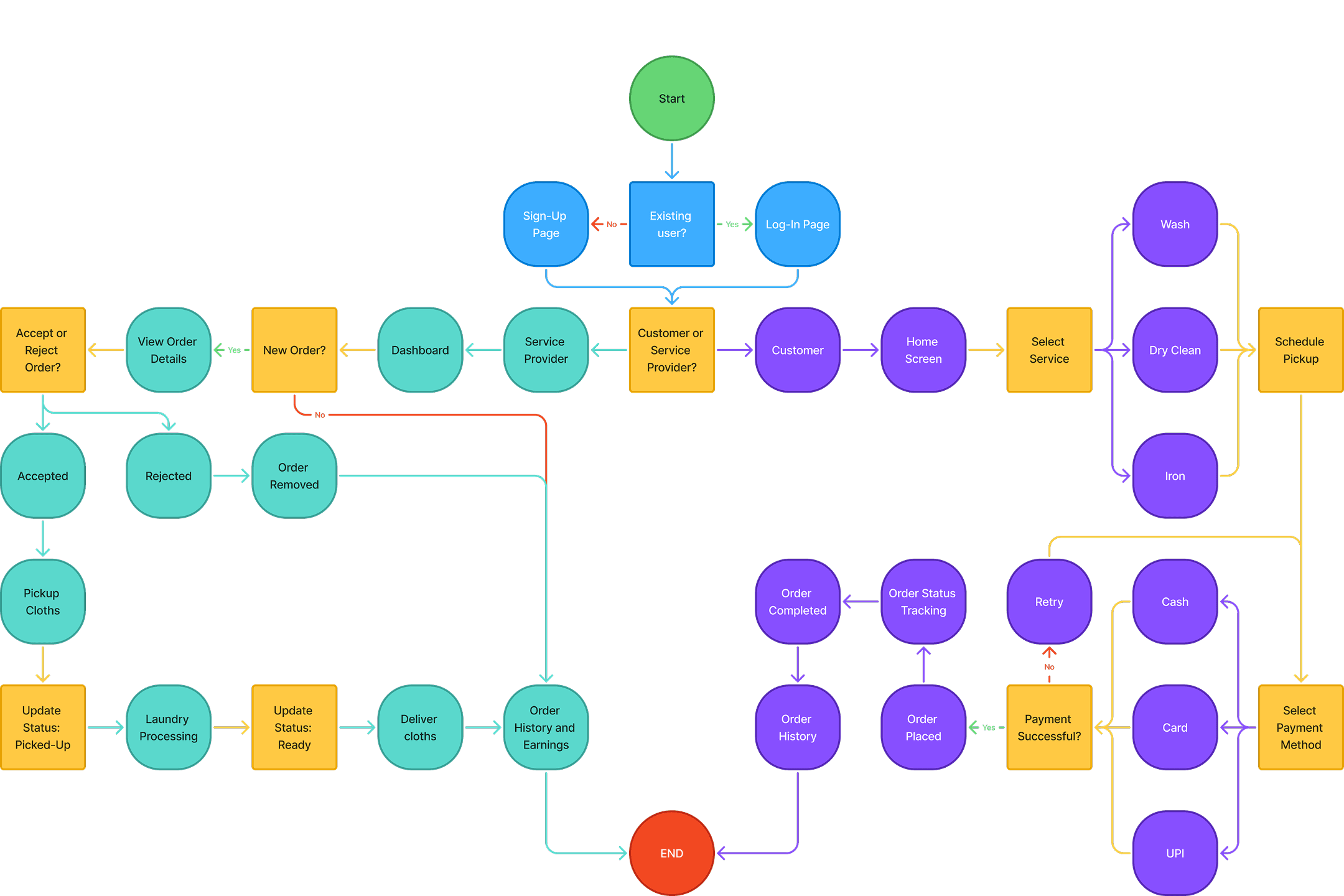
I plan before I execute. Before touching a single screen, I mapped the complete user flow end to end, covering both sides of the app, the customer booking a service and the service provider managing incoming orders. Getting this right up front meant I was not making structural decisions mid design, which is where inconsistency creeps in.
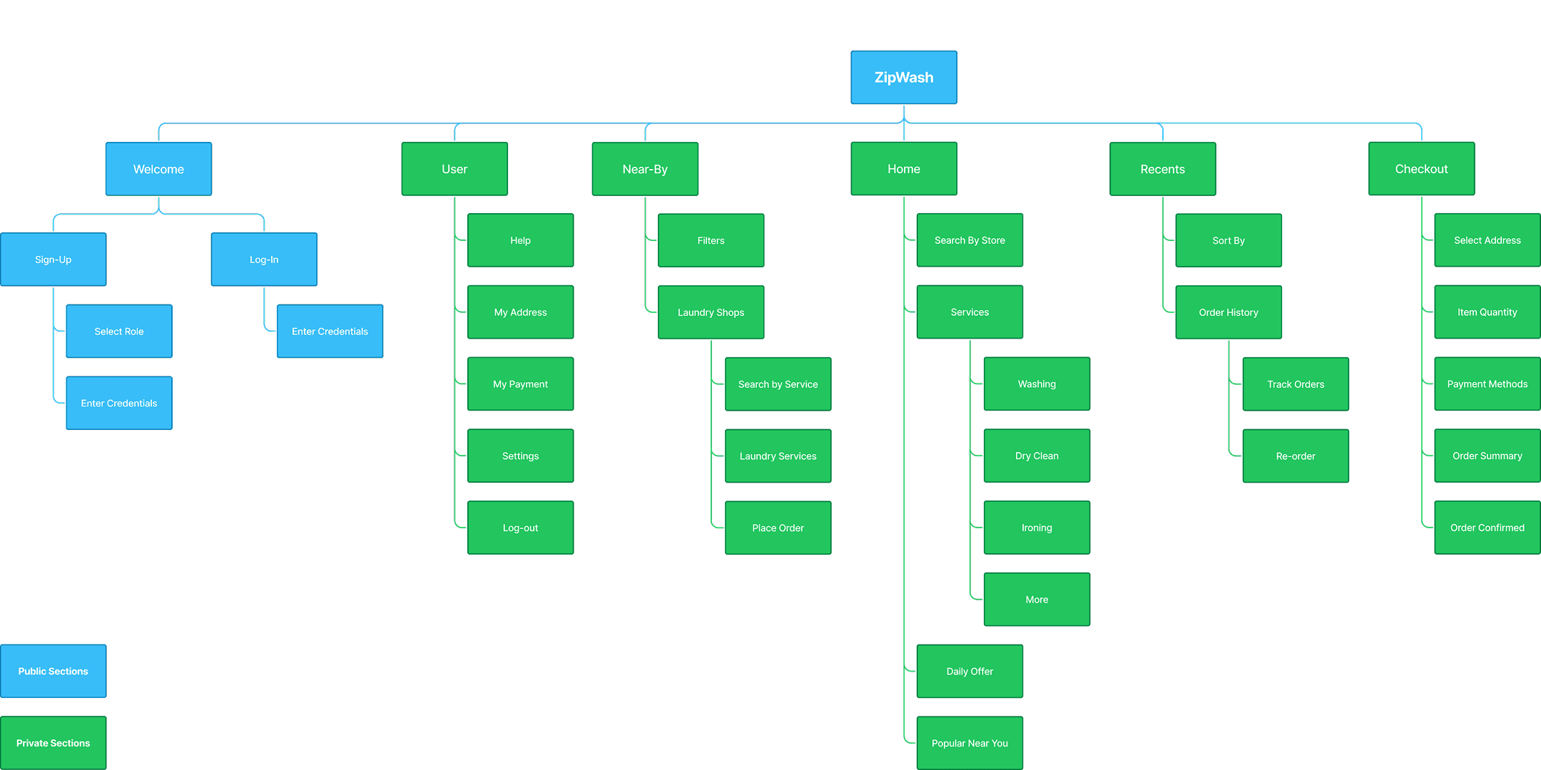
Alongside the flow, I built out the full information architecture as its own dedicated step. It is not a glamorous part of the process, but having every screen and its place in the hierarchy mapped out before wireframing meant the wireframes themselves moved fast. Navigation, screen relationships and where each piece of information lived were already decided by the time I started sketching layouts.
Building the System
For the visual language, I kept the core palette intentionally simple, a confident primary blue paired with a soft cyan accent, with green, amber, and red reserved strictly for status states like success, pending, and error. That restraint was deliberate. A laundry app lives or dies on how clearly it communicates order status, so the color system needed to carry meaning, not just decoration.
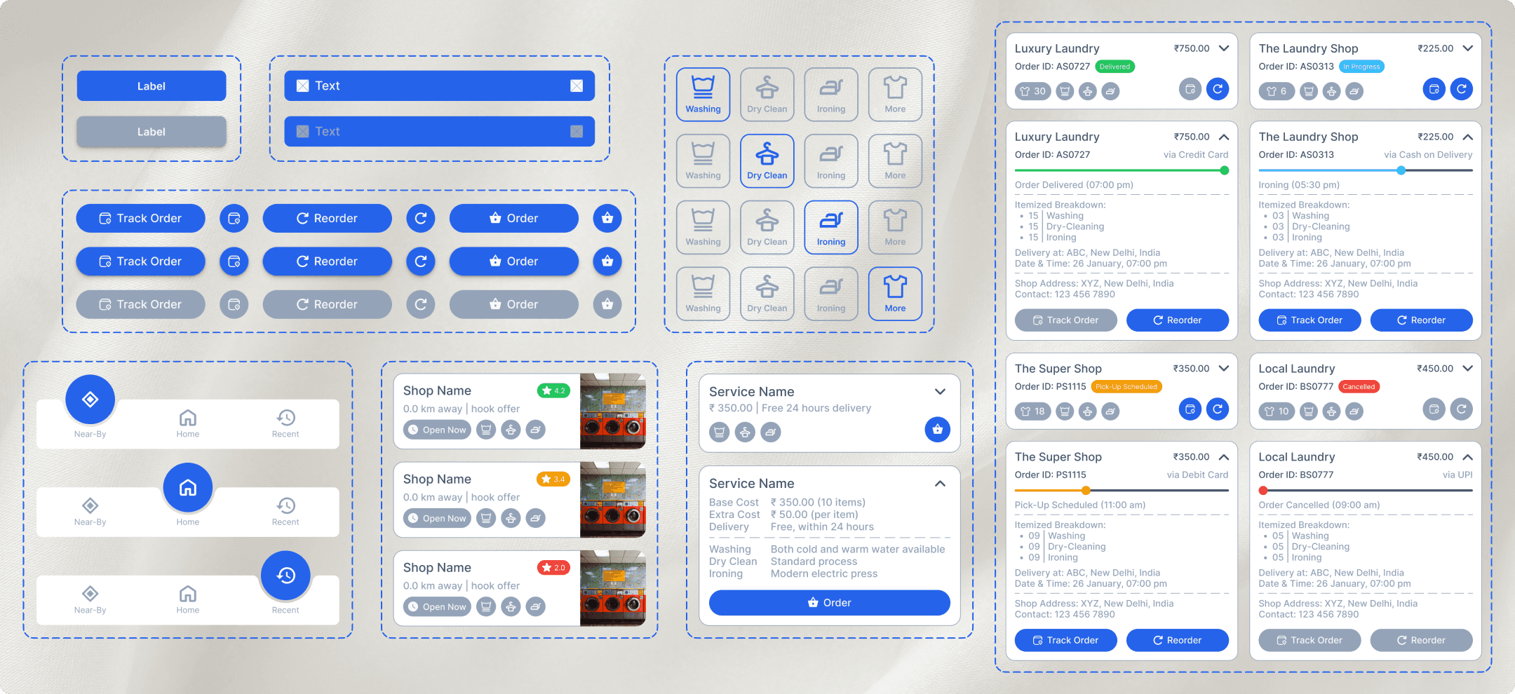
Where I spent the most time was on the UI component library rather than individual screens. Building out consistent patterns first, service cards, order cards with expandable breakdowns, status pills, the bottom navigation states, the dropdown and input styles, meant that every screen after that was closer to assembly than fresh design. It also meant the app felt cohesive by construction rather than by later cleanup. That component first approach is something I now treat as non-negotiable on any UI project.
From Structure to Screens
By the time I moved to wireframes, most of the hard decisions were already made, so wireframing became a check on layout and hierarchy rather than a discovery process. It is still where small gaps surface, deciding exactly how to show delivery time on a service card, or how to differentiate an open shop from a closed one at a glance, or where a rating should sit relative to the shop name. Working through those in low fidelity first meant the high-fidelity pass was fast and clean.
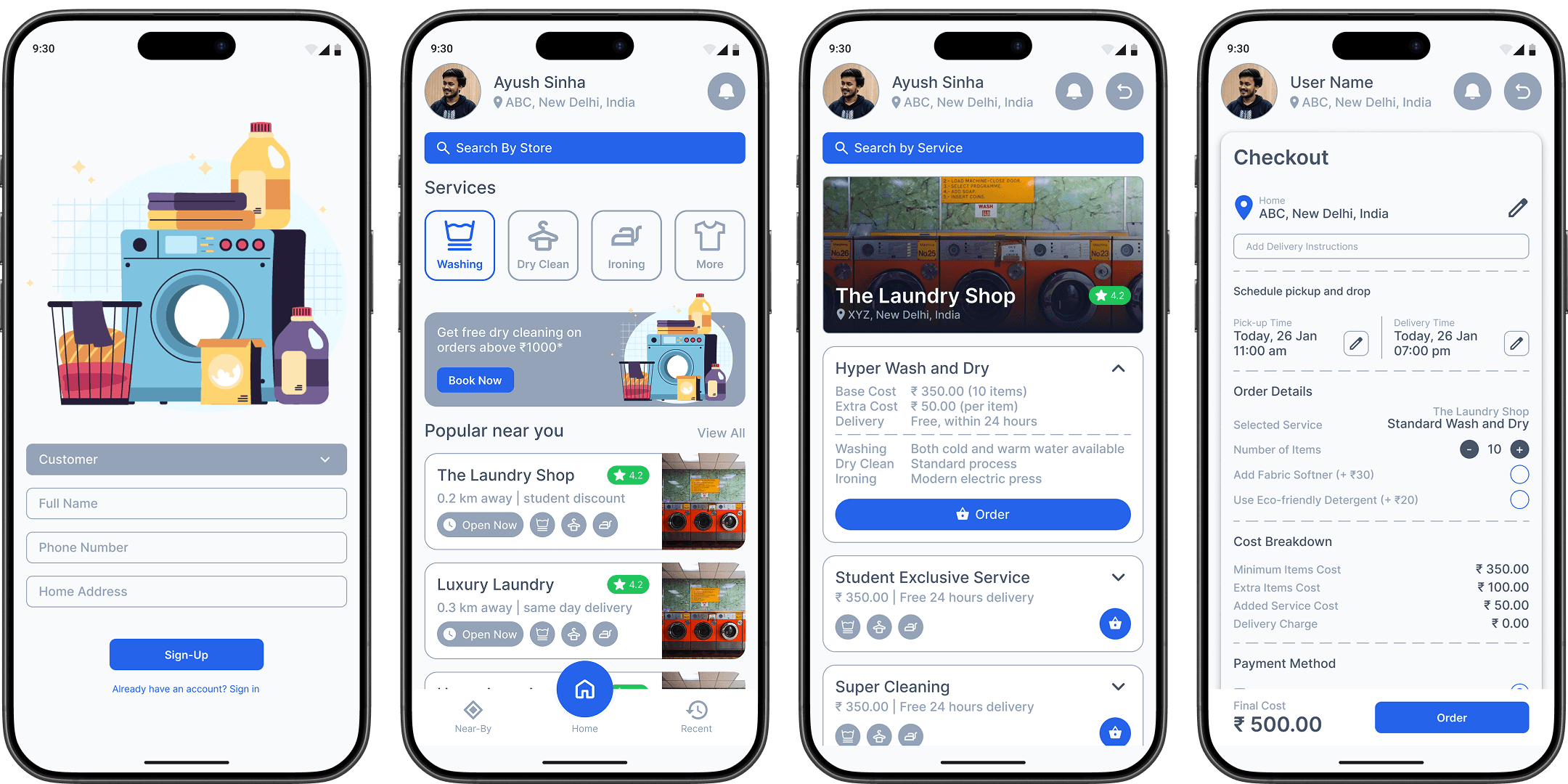
The final screens cover the full journey, onboarding, the home screen with services and nearby shops, live order tracking with a status timeline, and a checkout flow with a fully itemized cost breakdown. Transparency in that checkout screen was a direct design decision tied back to the research. Pricing distrust was one of the clearest pain points that came up, so every charge on that screen is broken down instead of bundled.
Closing Thoughts
What stayed with me most from this project is how much a clear problem statement does for every decision after it. Once I had that written down precisely, most of the design choices were not really choices anymore, they were just the logical next step. The empathy map and personas kept the scope honest, the flow and architecture kept the execution disciplined, and the component system kept the final screens consistent.
ZipWash is not a live product, but as an exercise in taking a real, under addressed problem all the way from research to a working design system, it did exactly what I set out to do.
Related Articles

